

Lightbox
Astro image detail views built with the existing dialog controller.
Mountains reflected in a lake
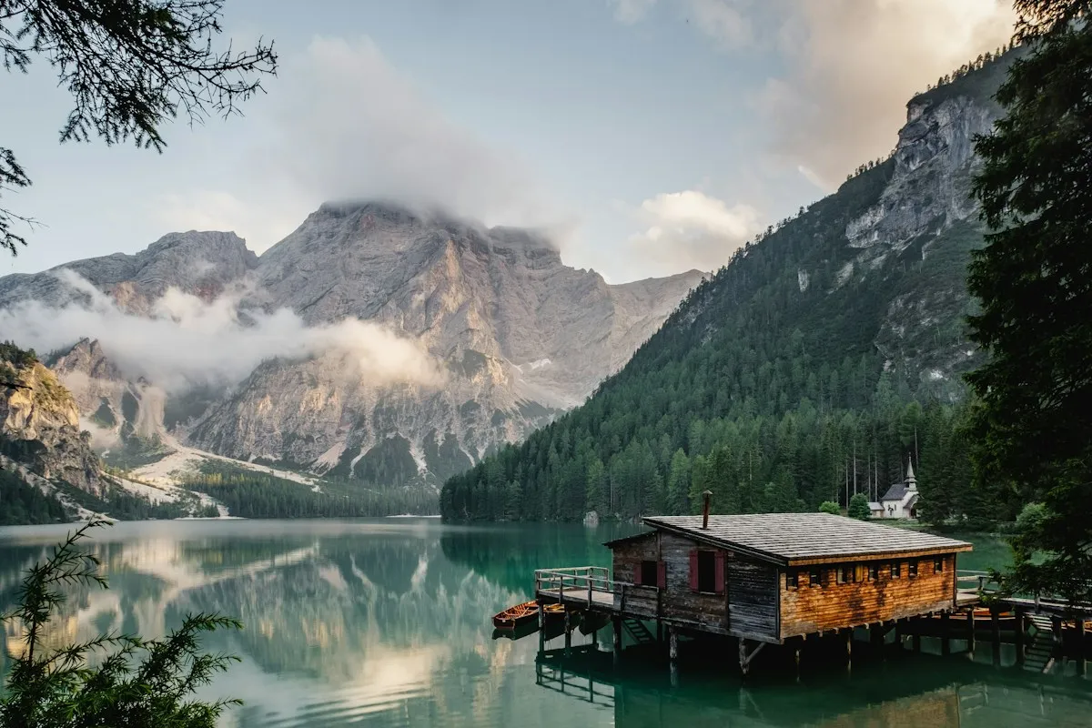
A quiet mountain lake.
---
import { Image } from "astro:assets"
import {
  Lightbox,
  LightboxContent,
  LightboxDescription,
  LightboxMedia,
  LightboxTitle,
  LightboxTrigger,
} from "@/components/ui/lightbox"
---

<div class="mx-auto w-full max-w-sm p-4">
  <Lightbox>
    <LightboxTrigger
      hoverZoom
      aria-label="View image: Mountains reflected in a lake"
    >
      <Image
        width={1200}
        height={800}
        class="aspect-3/2 w-full object-cover"
        src="https://images.unsplash.com/photo-1470770841072-f978cf4d019e?w=1200&h=800&auto=format&fit=crop"
        alt=""
        loading="lazy"
      />
    </LightboxTrigger>
    <LightboxContent>
      <LightboxTitle class="sr-only">
        Mountains reflected in a lake
      </LightboxTitle>
      <LightboxMedia>
        <Image
          width={1200}
          height={800}
          src="https://images.unsplash.com/photo-1470770841072-f978cf4d019e?w=1200&h=800&auto=format&fit=crop"
          alt="Mountains reflected in a lake"
          loading="lazy"
        />
      </LightboxMedia>
      <LightboxDescription>A quiet mountain lake.</LightboxDescription>
    </LightboxContent>
  </Lightbox>
</div>
Installation
bunx --bun shadcn@latest add @gnosticai/lightboxThe command also installs Dialog.
Usage
import {
	Lightbox,
	LightboxContent,
	LightboxDescription,
	LightboxMedia,
	LightboxTitle,
	LightboxTrigger,
} from "@/components/ui/lightbox"<Lightbox>
<LightboxTrigger hoverZoom aria-label="View image: Mountains reflected in a lake">
<img src="/lake.jpg" alt="" />
</LightboxTrigger>
<LightboxContent>
<LightboxTitle class="sr-only">Mountains reflected in a lake</LightboxTitle>
<LightboxMedia>
<img src="/lake.jpg" alt="Mountains reflected in a lake" />
</LightboxMedia>
<LightboxDescription>A quiet mountain lake.</LightboxDescription>
</LightboxContent>
</Lightbox>hoverZoom is optional. When you set it, the preview uses hover:scale-105.
The trigger clips that scale. Leave the prop unset to keep the preview still.
Keep links and buttons out of LightboxTrigger. The trigger is already a button.
Composition
Lightbox
├── LightboxTrigger
└── LightboxContent
    ├── LightboxTitle
    ├── LightboxMedia
    └── LightboxDescription
LightboxContent includes the backdrop, the panel, and the close button.
Use LightboxPortal, LightboxOverlay, and LightboxClose when you build a
custom panel. Set variant="viewport" for a dark full-screen view.
Lightbox Carousel uses that variant.
Lightbox Grid uses the centered panel.
API Reference
Lightbox
defaultOpen?boolean
Initial open state
booleanonOpenChange?(open: boolean) => void
Callback when open state changes
(open: boolean) => voidcloseOnClickOutside?boolean
Close when clicking overlay
booleancloseOnEscape?boolean
Close when pressing Escape
booleanlockScroll?boolean
Lock body scroll when open
booleanalertDialog?boolean
Use alertdialog role for blocking confirmations
booleanLightboxContent
variant?LightboxPopupVariantProps['variant']
`panel` centers the image in a dialog. `viewport` fills the screen and uses a dark backdrop.
LightboxPopupVariantProps['variant']'panel'showCloseButton?boolean
Show the close button.
booleantrueoverlayClass?string
Extra classes for the backdrop.
stringLightboxTrigger
hoverZoom?boolean
Scale the preview on hover. Adds the class `hover:scale-105`.
booleanfalseLightboxTitle
LightboxTitle names the dialog. Hide it with class="sr-only" when the
image is the only content.
LightboxDescription
LightboxDescription is the caption under the
image. LightboxMedia holds the enlarged image.
Dialog handles focus, Escape, outside clicks, and scroll locking.
When to use Lightbox
Use Lightbox to open a larger image from a thumbnail or gallery. Keep the trigger image useful at its displayed size and put the full image and caption in the dialog composition.
Keyboard and behavior
The dialog controller handles modal focus, Escape, and outside dismissal. Give the view a title and the image accurate alt text. A close control must remain available without a pointer gesture.
Theme and layout
Choose image dimensions and object-fit behavior that preserve useful detail. Test tall and wide images on a phone so neither the close control nor caption is hidden.
Related choices
Use Lightbox Carousel for a sequence and Lightbox Grid for a thumbnail layout.