

Lightbox Grid
Responsive Astro gallery grids with bento and masonry layouts.
Mountains reflected in a lake
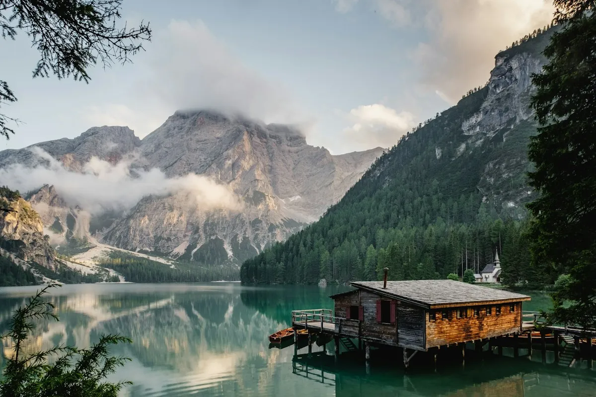
A quiet mountain lake.
Sunlight through forest trees

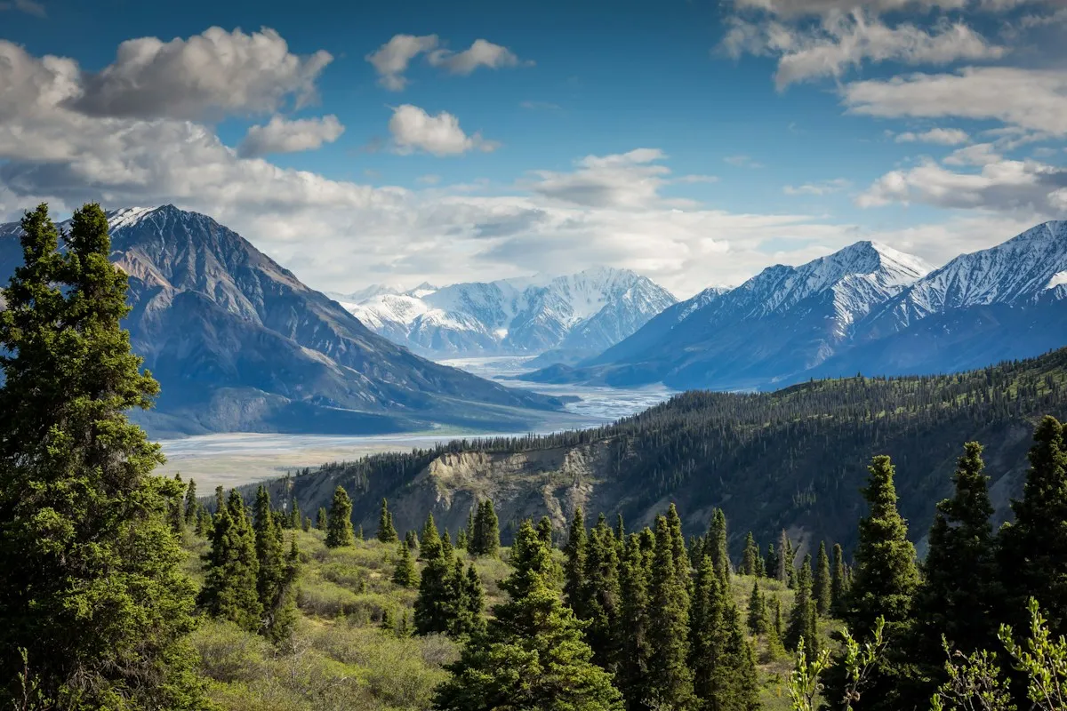
Open landscape in evening light

A mountain peak above the clouds
Deer in a green forest

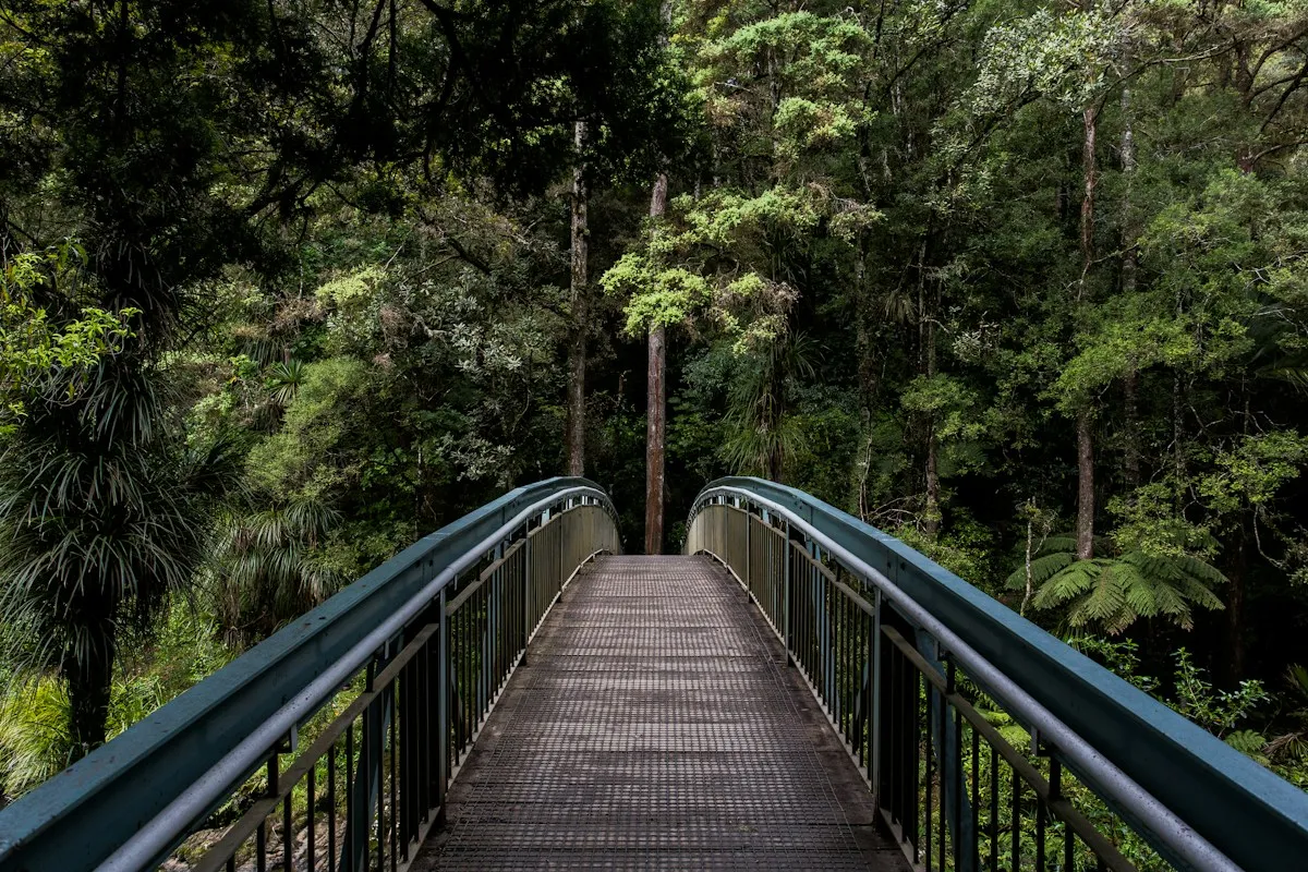
A path through tall trees
---
import { Image } from "astro:assets"
import { LightboxGrid, LightboxGridItem } from "@gnosticai/ui/ui/lightbox-grid"

const images = [
  {
    src: "https://images.unsplash.com/photo-1470770841072-f978cf4d019e?w=1200&h=800&auto=format&fit=crop",
    width: 1200,
    height: 800,
    alt: "Mountains reflected in a lake",
    caption: "A quiet mountain lake.",
  },
  {
    src: "https://images.unsplash.com/photo-1441974231531-c6227db76b6e?w=1200&h=800&auto=format&fit=crop",
    width: 1200,
    height: 800,
    alt: "Sunlight through forest trees",
  },
  {
    src: "https://images.unsplash.com/photo-1500530855697-b586d89ba3ee?w=1200&h=800&auto=format&fit=crop",
    width: 1200,
    height: 800,
    alt: "Open landscape in evening light",
  },
  {
    src: "https://images.unsplash.com/photo-1464822759023-fed622ff2c3b?w=1200&h=800&auto=format&fit=crop",
    width: 1200,
    height: 800,
    alt: "A mountain peak above the clouds",
  },
  {
    src: "https://images.unsplash.com/photo-1472396961693-142e6e269027?w=1200&h=800&auto=format&fit=crop",
    width: 1200,
    height: 800,
    alt: "Deer in a green forest",
  },
  {
    src: "https://images.unsplash.com/photo-1447752875215-b2761acb3c5d?w=1200&h=800&auto=format&fit=crop",
    width: 1200,
    height: 800,
    alt: "A path through tall trees",
  },
]
---

<div class="w-full p-4">
  <LightboxGrid>
    {images.map(({ caption, ...image }) => (
      <LightboxGridItem alt={image.alt} caption={caption}>
        <Image
          slot="thumbnail"
          widths={[320, 640, 960]}
          sizes="auto, 100vw"
          {...image}
          class="size-full object-cover"
          loading="lazy"
        />
        <Image
          slot="content"
          widths={[640, 960, 1200]}
          sizes="(min-width: 72rem) 70rem, calc(100vw - 4rem)"
          {...image}
          loading="lazy"
        />
      </LightboxGridItem>
    ))}
  </LightboxGrid>
</div>
Installation
bunx --bun shadcn@latest add @gnosticai/lightbox-gridUsage
Map images in the consumer. Supply both named slots for each item. You control image dimensions, crop, loading, and Astro image optimization.
---
import { Image } from "astro:assets"
import { LightboxGrid, LightboxGridItem } from "@/components/ui/lightbox-grid"
import lake from "../assets/lake.jpg"

const images = [{ src: lake, alt: "Mountains reflected in a lake" }]
---

<LightboxGrid>
  {images.map((image) => (
    <LightboxGridItem alt={image.alt}>
      <Image
        slot="thumbnail"
        {...image}
        widths={[320, 640, 960]}
        sizes="auto, 100vw"
        class="size-full object-cover"
        loading="lazy"
      />
      <Image
        slot="content"
        {...image}
        widths={[640, 1200, 1920]}
        sizes="(min-width: 72rem) 70rem, calc(100vw - 4rem)"
        loading="lazy"
      />
    </LightboxGridItem>
  ))}
</LightboxGrid>
The grid accepts children only. It does not accept an images array or render
images internally. Keep links and buttons out of the thumbnail slot because
it is inside a button. alt supplies the trigger label and dialog title;
set image alt text on your images too.
One source, two views
Both slots use the same imported image. Astro generates srcset from widths.
The thumbnail uses smaller candidates; the dialog uses larger candidates.
Choose widths that suit your source images and display sizes.
For lazy thumbnails, sizes="auto, 100vw" lets supporting browsers use the
rendered tile width, including changes to its container. 100vw is the fallback.
The dialog’s sizes matches its maximum width and padding. Adjust these values
if you change the layout. The browser selects a candidate for each view; a
small thumbnail does not mean the dialog must use that same file.
Masonry and resizing
Use layout="masonry" with class="h-auto w-full" on thumbnail images to retain
their aspect ratios. Each column contains images of different heights without
fixed rows. CSS columns read from top to bottom, then across. Bento uses row
order. Masonry ignores span, rowHeight, and minRows.
Drag the example’s right handle, or focus it and use the arrow keys. The docs
wrapper adds the handle with <Component resizable />. Its controls are not
part of the example source. The full preview shows the example at window width.
A wizard looking over a town

A wizard at a cave entrance

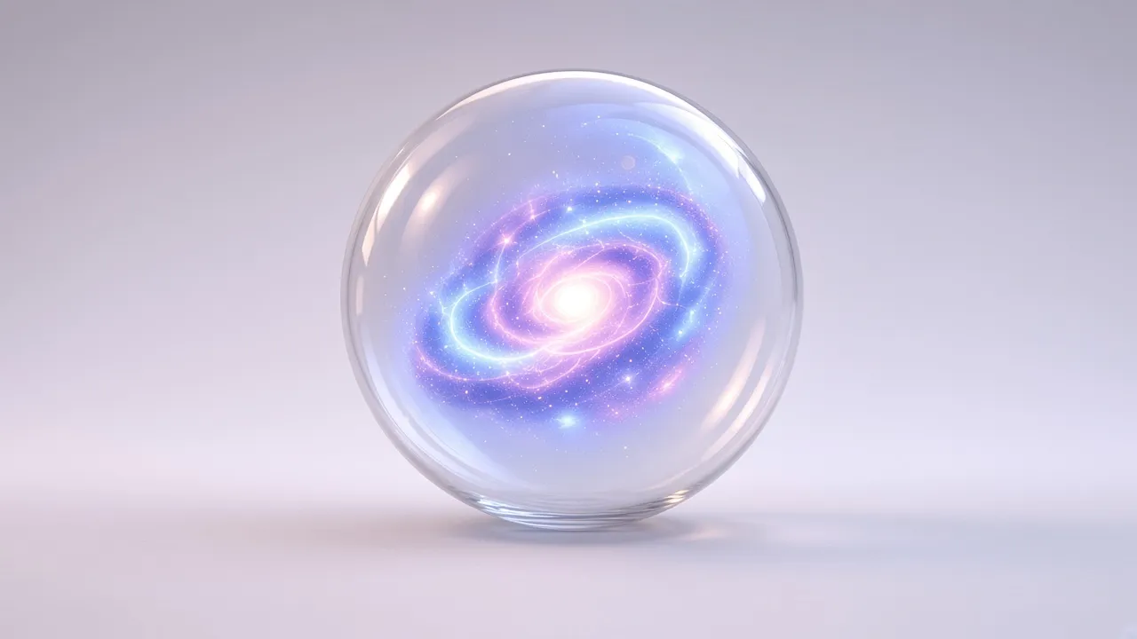
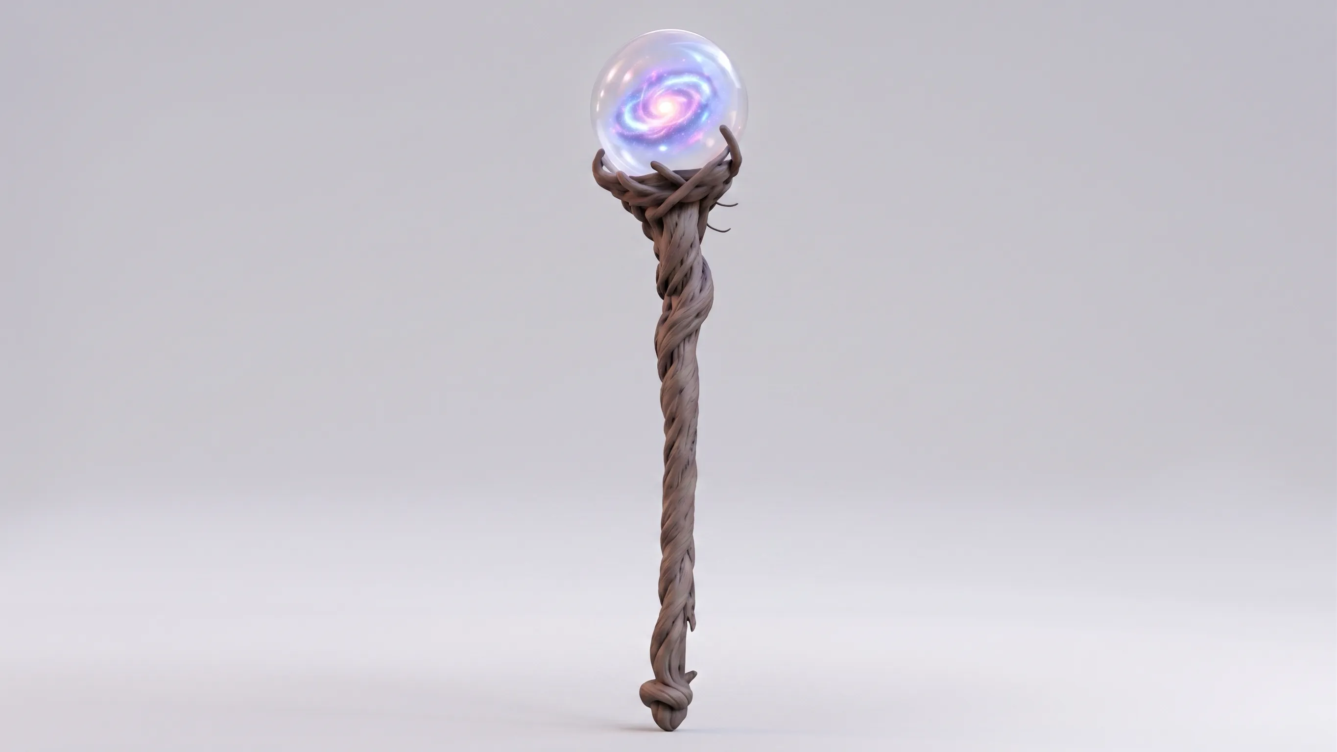
A glowing galaxy orb
A wizard with a staff
A wizard above a town
A wizard portrait

---
import { Image } from "astro:assets"
import { LightboxGrid, LightboxGridItem } from "@gnosticai/ui/ui/lightbox-grid"
import town from "../../../src/assets/wizard/gnostic-wizard-looking-over-town.png"
import cave from "../../../src/assets/wizard/gnostic-ai-wizard-on-cave-edge.png"
import orb from "../../../src/assets/wizard/galaxy-orb.jpg"
import staff from "../../../src/assets/wizard/wizard-staff.jpeg"
import overlook from "../../../src/assets/wizard/gnostic-ai-wizard-overlook-town.png"
import wizard from "../../../src/assets/wizard/gnostic-wizard.jpg"

const images = [
  { src: town, alt: "A wizard looking over a town" },
  { src: cave, alt: "A wizard at a cave entrance" },
  { src: orb, alt: "A glowing galaxy orb" },
  { src: staff, alt: "A wizard with a staff" },
  { src: overlook, alt: "A wizard above a town" },
  { src: wizard, alt: "A wizard portrait" },
]
---

<div class="w-full p-4">
  <LightboxGrid layout="masonry" gap="0.75rem">
    {images.map((image) => (
      <LightboxGridItem alt={image.alt}>
        <Image
          slot="thumbnail"
          widths={[320, 640, 960]}
          sizes="auto, 100vw"
          {...image}
          width={640}
          class="h-auto w-full"
          loading="lazy"
        />
        <Image
          slot="content"
          widths={[640, 1200, 1920]}
          sizes="(min-width: 72rem) 70rem, calc(100vw - 4rem)"
          {...image}
          loading="lazy"
        />
      </LightboxGridItem>
    ))}
  </LightboxGrid>
</div>
Named slots and tile spans
Use Image, Picture, or your own image markup in thumbnail and content.
For bento tiles, size-full object-cover fills the tile. For masonry, use
h-auto w-full or set your own image height.
Mountains reflected in a lake
Custom images in named slots.
Sunlight through forest trees
A mountain peak above the clouds
---
import { Image } from "astro:assets"
import { LightboxGrid, LightboxGridItem } from "@gnosticai/ui/ui/lightbox-grid"
---

<div class="w-full max-w-xl p-4">
  <LightboxGrid style="--lightbox-grid-row-height: 10rem; --lightbox-grid-gap: 1rem;">
    <LightboxGridItem
      alt="Mountains reflected in a lake"
      span="wide"
      caption="Custom images in named slots."
    >
      <Image
        width={1200}
        height={800}
        slot="thumbnail"
        widths={[320, 640, 960]}
        sizes="auto, 100vw"
        class="size-full object-cover"
        src="https://images.unsplash.com/photo-1470770841072-f978cf4d019e?w=1200&h=800&auto=format&fit=crop"
        alt="Mountains reflected in a lake"
        loading="lazy"
      />
      <Image
        width={1200}
        height={800}
        slot="content"
        widths={[640, 960, 1200]}
        sizes="(min-width: 72rem) 70rem, calc(100vw - 4rem)"
        src="https://images.unsplash.com/photo-1470770841072-f978cf4d019e?w=1200&h=800&auto=format&fit=crop"
        alt="Mountains reflected in a lake"
        loading="lazy"
      />
    </LightboxGridItem>
    {[
      {
        src: "https://images.unsplash.com/photo-1441974231531-c6227db76b6e?w=1200&h=800&auto=format&fit=crop",
        alt: "Sunlight through forest trees",
      },
      {
        src: "https://images.unsplash.com/photo-1464822759023-fed622ff2c3b?w=1200&h=800&auto=format&fit=crop",
        alt: "A mountain peak above the clouds",
      },
    ].map((image) => (
      <LightboxGridItem alt={image.alt}>
        <Image
          slot="thumbnail"
          widths={[320, 640, 960]}
          sizes="auto, 100vw"
          {...image}
          width={1200}
          height={800}
          class="size-full object-cover"
          loading="lazy"
        />
        <Image
          slot="content"
          widths={[640, 960, 1200]}
          sizes="(min-width: 72rem) 70rem, calc(100vw - 4rem)"
          {...image}
          width={1200}
          height={800}
          loading="lazy"
        />
      </LightboxGridItem>
    ))}
  </LightboxGrid>
</div>
API
LightboxGrid accepts native div attributes and these options:
| Prop | Type | Default | Purpose |
|---|---|---|---|
layout |
bento or masonry |
bento |
Fixed-row tiles or natural-height columns. |
minCols |
1, 2, 3, 4 |
1 |
Minimum columns at all container widths. |
minRows |
1, 2, 3, 4 |
1 |
Minimum explicit rows in bento layout. |
rowHeight |
CSS length | 14rem |
Height of automatic bento rows. |
gap |
CSS length | 0.5rem |
Space between tiles. |
The default is one column below 30rem, two from 30rem, and four from 48rem.
These are container widths. minCols sets a lower limit. Set
--lightbox-grid-gap and --lightbox-grid-row-height in style to override
the corresponding props.
LightboxGridItem accepts native div attributes and these options:
| Prop | Type | Default | Purpose |
|---|---|---|---|
alt |
string |
Required | Trigger label and dialog title. |
caption |
string |
— | Optional text below the full image. |
span |
auto, square, wide, tall, large |
auto |
Bento tile size. |
hoverZoom |
boolean |
true |
Scale the thumbnail on hover with hover:scale-105. |
Both thumbnail and content slots are required. wide spans two columns,
tall spans two rows, and large spans both. Explicit spans apply from 30rem.
auto creates the bento pattern from 48rem. square occupies one cell; its
shape follows the column width and row height.
Pass local image imports directly to Astro Image. String sources need
width and height. Remote optimization also needs an allowed domain or
remote pattern in Astro configuration. See the
Astro image guide.
The enlarged view is a Lightbox. Dialog handles focus, Escape, outside clicks, and scroll locking. Close the dialog to select another image.
When to use Lightbox Grid
Use LightboxGrid to arrange related images before opening their detail views. Choose the layout and minimum column count from the supported props. Set row height and gap to suit the image proportions.
Keyboard and behavior
Each image trigger needs a clear name and visible focus. Keep the DOM order meaningful even when the grid has varied spans. The visual layout should not be used to change the reading order of a story.
Theme and layout
Container queries adapt the grid to its available width. Check it inside narrow cards as well as full-page sections. Supply image dimensions and intentional crops; the grid cannot restore detail removed by a crop.
Related choices
Use Lightbox for one image and Lightbox Carousel for a sequential gallery.